
In order to get to know your user, you have to get into your user’s mind.
What is cognitive Bias?
In psychological terms, cognition refers to “a mental action or a process of acquiring knowledge and understanding through a thought, experience or the senses.” Likewise Cognitive bias is a tendency of people to perceive information based on their own experiences and preferences. Cognitive biases are these mental shortcuts called as heuristics, that often plays a major contributing role. Sometimes they can be surprisingly accurate or can lead to errors in a natural thinking. Suppose you have to think about possible options in your decision making process. By the amount of information available to you it becomes more complex sometimes and you might end up taking more time than usual to make even one simplest decision. Therefore, these mental shortcuts are found important in order for quick decision making.
Example:
You are walking alone by the streets late night in the dark and you hear some unusual noises from behind. You thought there’s someone following you so decided to walk fast or run quickly by that place in order to avoid dangerous situations. In reality, there was just a dog making that weird noise while sleeping and nothing else. By relying on mental shortcuts your mind tend to think in a different pattern and end up making a simplest and quickest spontaneous decision to escape or avoid the situation.
Now as we know what cognitive bias is, let’s get to know some UX laws based on cognitive bias with some practical examples and how to apply them in designs.
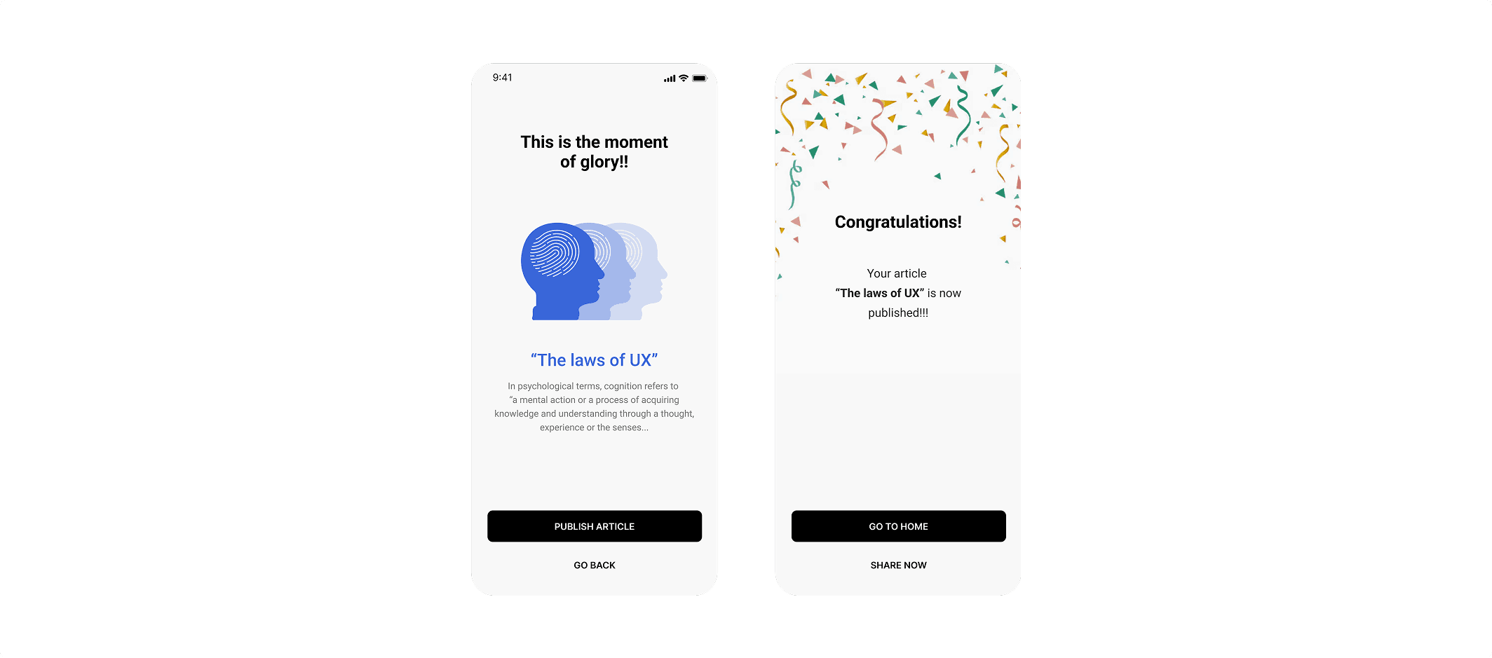
This law explains that, people judge experiences largely based on how they felt at its peak and at its end. For a user, all the experiences he felt from highest peak to the end is an average of every moment.
Example:
Ben visits Hawaii for a trip and performs following activities:


How he felt? (his activity wise experience of a week)
While watching sunrise: He felt good
While scuba diving: He enjoyed it most
While having lunch: He didn’t like the food much
While having beach party: He quite enjoyed it
How he told?
“It was a best trip, I enjoyed there a lot”
Theory behind this-
Basically, ben didn’t told about his individual experiences that he had. Instead he told about all the experiences he felt from highest peak to the end in an average of his every moment. (by considering his moments where he felt most good and on the basis of how it ended)
How to apply them in designs-

Theory behind this-
This law suggests that we judge our experience of an event based on two parts, the peak and the end. So these interfaces are designed by paying close attention to the most intense, valuable and helpful moments and the endpoint of the user’s experience.
Point to remember -
Focus attention on critical points/activities of user where they feel most important, valuable and helpful.
Serial positioning effect is a tendency of person to remember the first and the last thing he sees.
Example:
Read the alphabets given below loudly.



Theory behind this-
Why this happened? There are 2 factors for it.
1. Primacy — where person remembers “ABC” which was obviously beginning part of the brainstorm.
2. Recency — where person remembers “XYZ” which was obviously recent(last viewed) part of the brainstorm.
How to apply them in designs-


Theory behind this-
Most users have a relatively short attention span. By above example- few people use menus with just a few items like home (first) and profile (last) from the grouped options. The serial position effect describes how our memory is affected by the position of information in a sequence. It suggests that we best remember the first and last items in a series and find it hard to remember the middle items.
Point to remember -
Put less important contents in the middle and more important contents in the beginning and at the end.
This law explains that — when multiple similar objects are placed together, the one that differs from the rest is most likely to be remembered by a user.
Example:
Ben visits Hawaii for a trip and performs following activities:


Theory behind this-
Have a look at the picture above. You most certainly noticed the red circle. It is so different from the other shapes that it becomes easy to notice and remember. Objects that stand out against their peers are more memorable. The more extreme the difference is, the better the effect works.
How to apply them in designs-

Theory behind this-
In the example above, this interface draws your attention to the Middle plan. The Different colour outline, Purple tag chip, and purple colored button ensures that is the one you notice initially and will recall first. This is great for their business, as most users will opt for that one instead of spending time on the lower priced plans.
Point to remember -
Make important decision features look different than others. (You can make them look different by using contrast colours to make elements stand out)
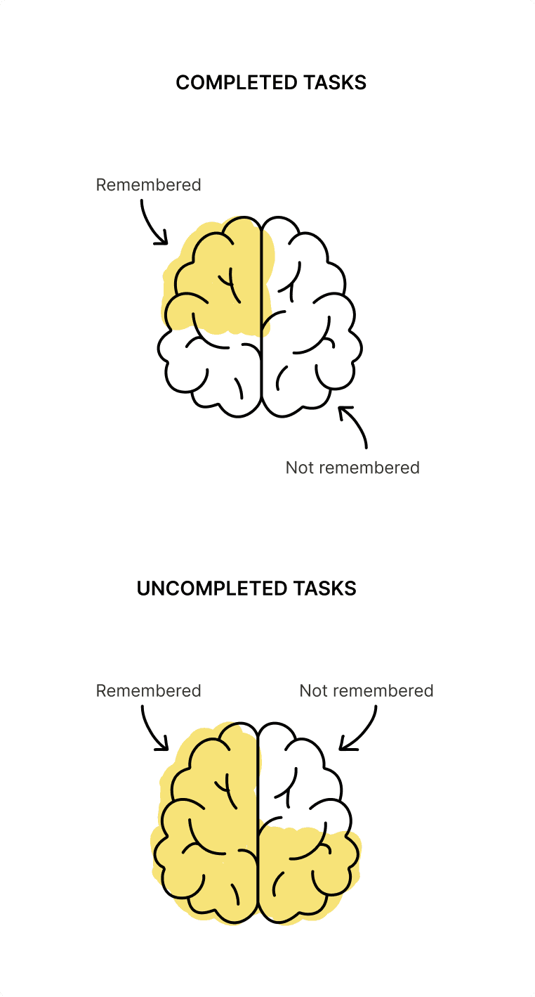
This law explains that — People are more likely to remember uncompleted or interrupted tasks more than completed ones.
Example:
Visual representation of memory retention for completed and uncompleted tasks.

Theory behind this-
This Effect suggests that not completing a task creates mental tension, which keeps it at the forefront of our memory. The only thing that will relieve this tension, is closure brought on by completing the task. Even thinking about an unresolved bug in the code over a whole weekend can be considered as an effect, ‘Zeigarnik Effect’ has on you!
How to apply them in designs-

Theory behind this-
For example, LinkedIn uses this trick to make users complete their profile. It has a profile strength indicator which includes a link that says “Improve Your Profile Strength.” Once you click on it, you’ll see all the things you can do to complete your profile and move up a level. (Beginner to Intermediate to All star).
Point to remember -
Provide clear indication of progress in order to motivate users to complete tasks.